
Environmental / Graphic Design
Modernizing an old story to feel new for all audiences.
Perimeter Church // Easter 2018
Challenge
Can we tell the familiar story of Easter in a modern way that avoids clichés? How can we make the old narrative feel fresh to both those who have heard it all their lives and those who might hear it for the first time this year?
Outcome
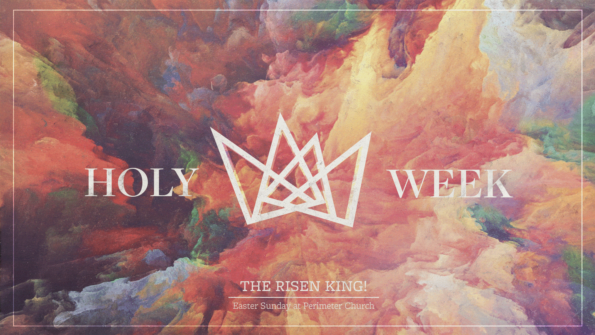
A visual identity that focuses on King imagery to complement Perimeter's primary messaging theme for the week: The Risen King. The use of textures, colors, and geometric shapes modernize the look and make it feel fresh to all audiences.
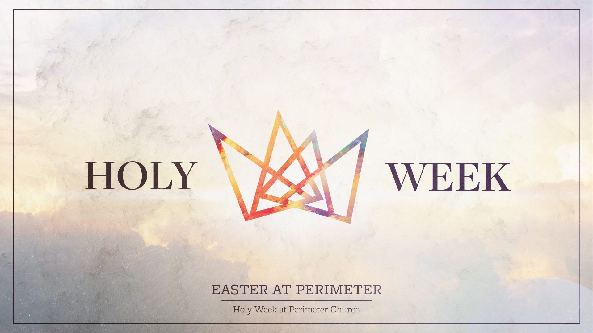
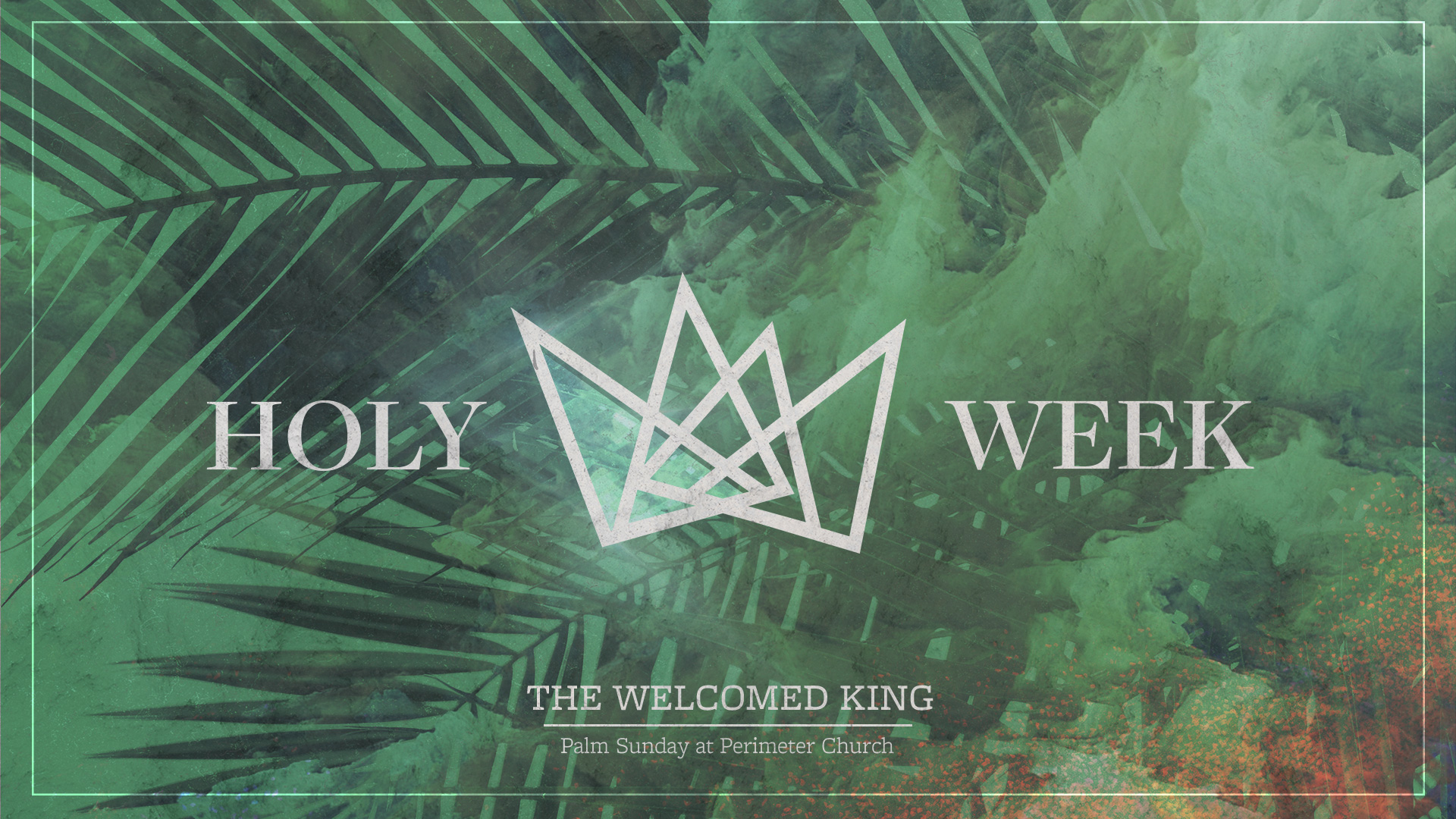
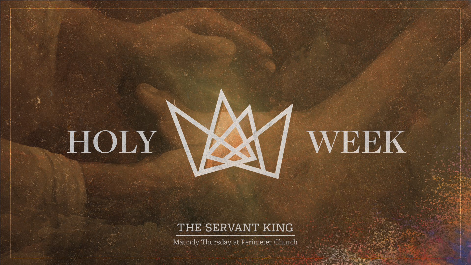
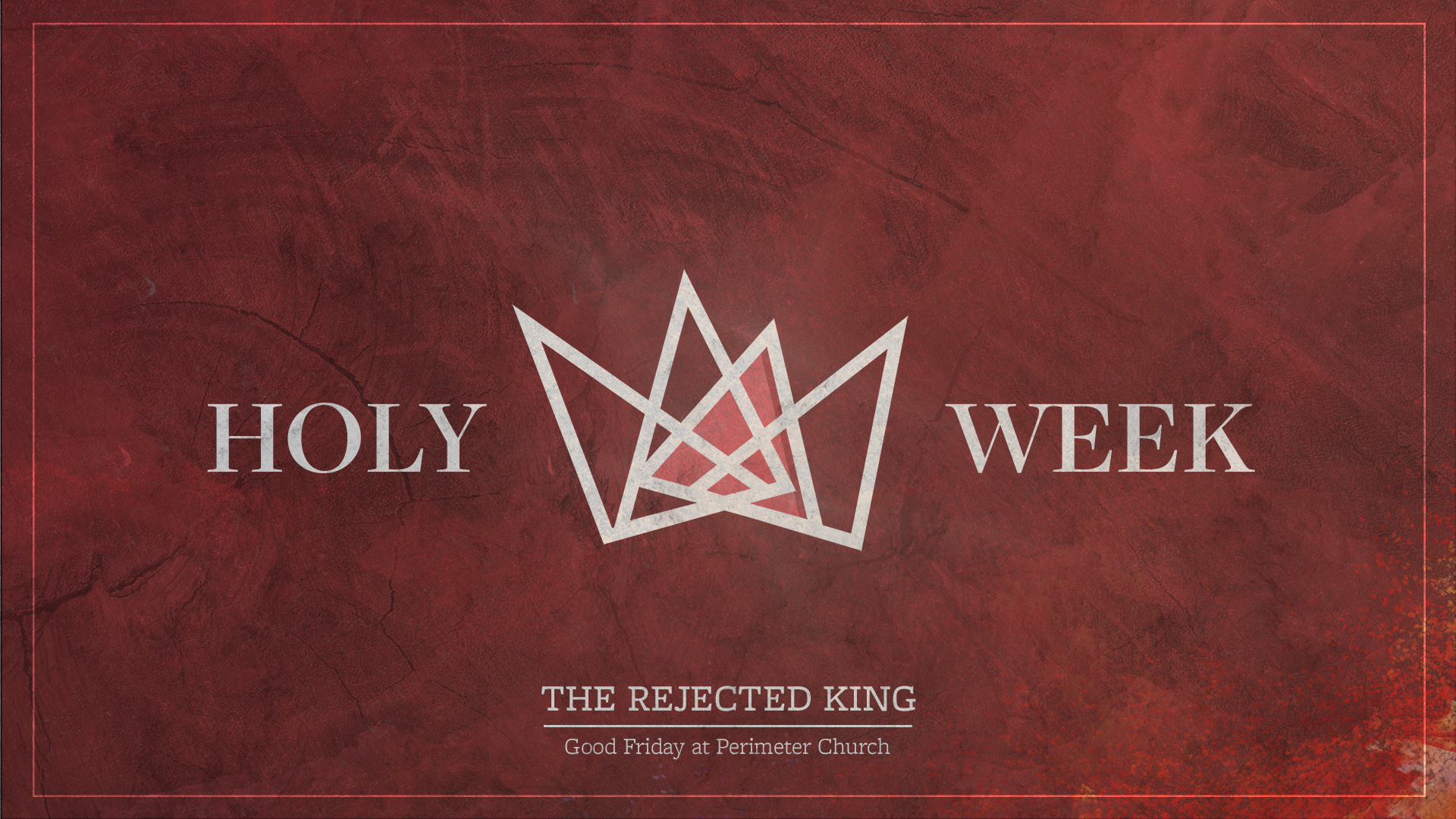
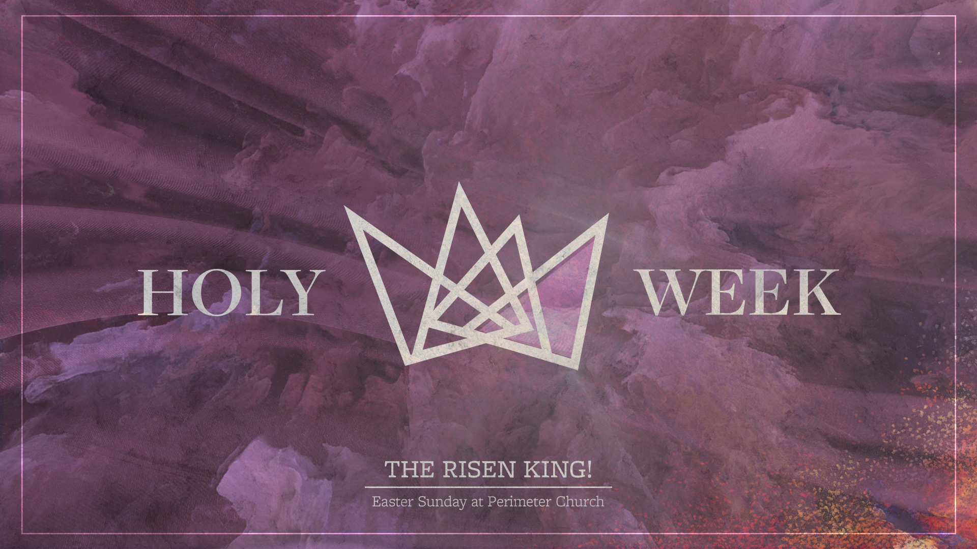
As usual, we made a style guide with main graphics, design elements, colors, typefaces, dropcaps, rationale—the whole shebang.
View the full Easter Style Guide here.
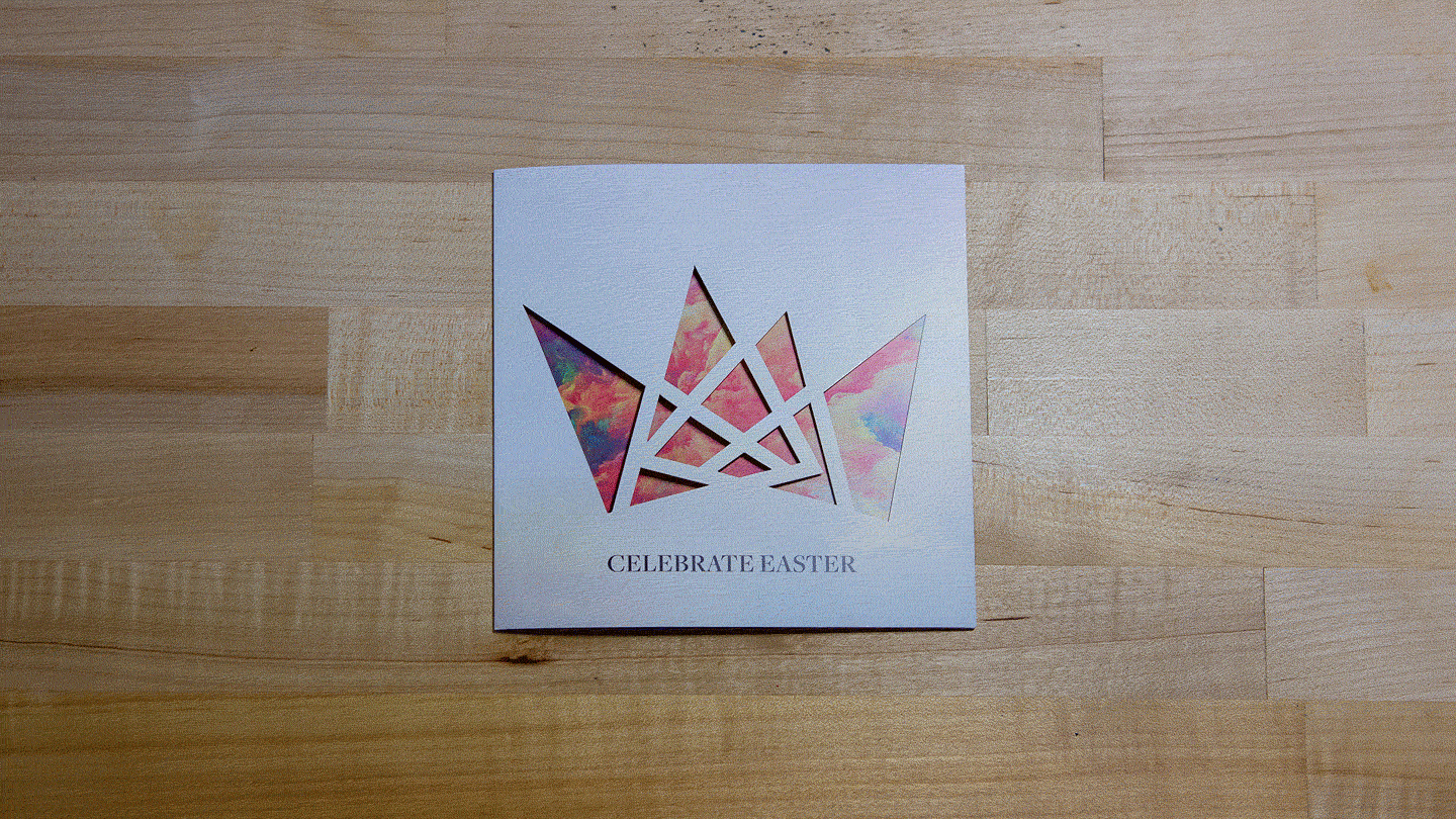
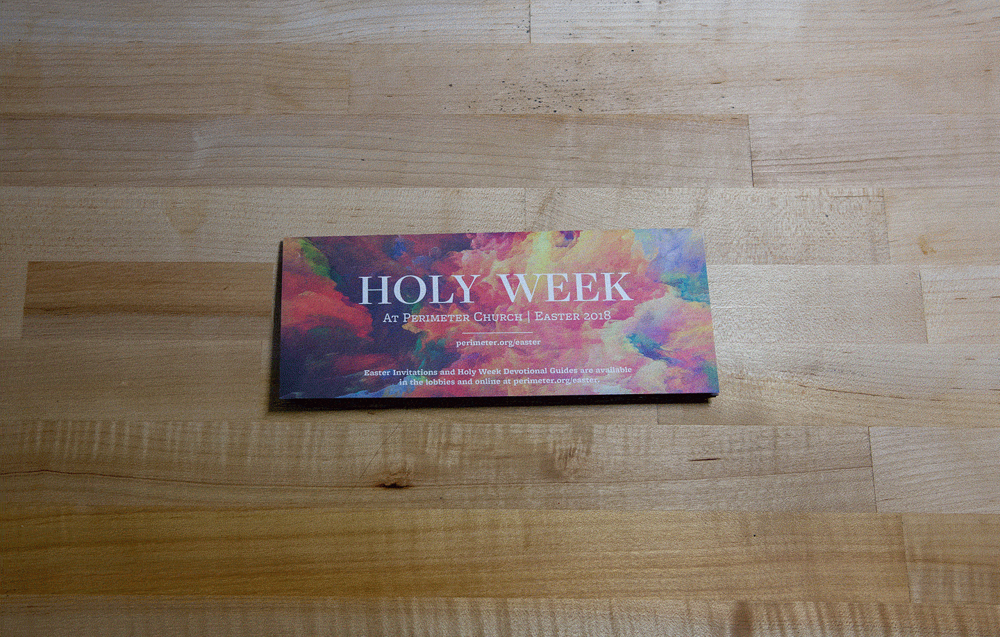
Print & Digital Applications
Using the look laid out in the Style Guide, we designed 62+ print and digital pieces for this project, including:
- Tri-fold invitations (with spot gloss)
- Devotional booklets
- T-shirts
- Promotional graphics
- Mailers
- Environmental signage
- Bulletin shells & inserts
- Flyers
Installations
We then applied the same design environmentally (1) on Perimeter’s Main Sanctuary stage and (2) on the main lobby walls.