
Making opposite goals work together for the biggest event of the year.
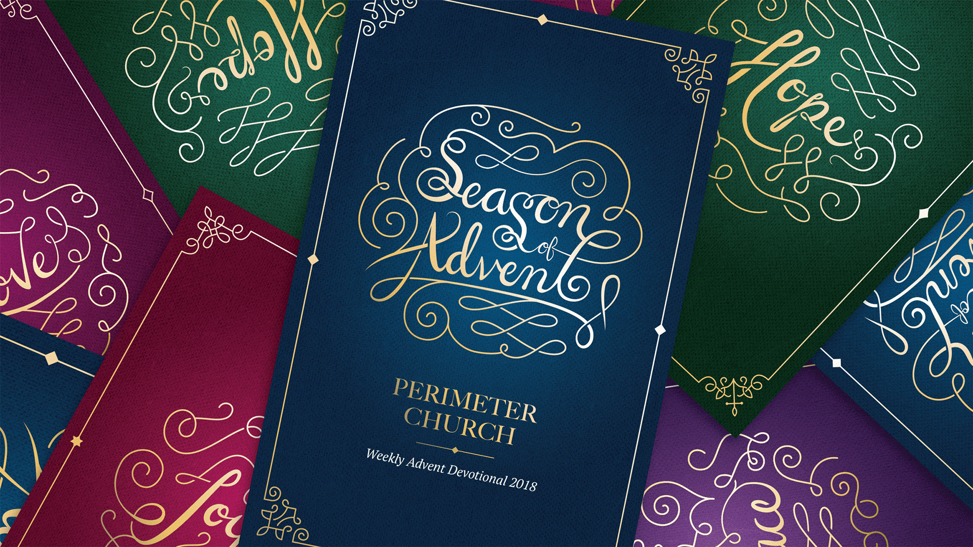
Perimeter Church // Season of Advent
For a church, Christmas is the most important event of the year. More attendance, more gatherings, more events. Perimeter trusts Braintrust to create a visual language to use across all happenings each Advent season. We make style guidelines, books, videos, installations, merchandise—and everything in between.
Challenge
Can we craft a visual language that sends several unique messages but feels cohesive? Can it pay homage to Christian tradition while also evoking the right emotions in the unchurched? Can it feel vintage and hand-crafted and modern at the same time? Can it capture both seriousness and joy? And on top of all that—can we use this look to tell the stories of the client's people and adapt the season across any medium? How can all of these opposites work together for the biggest season of the year?
Outcome
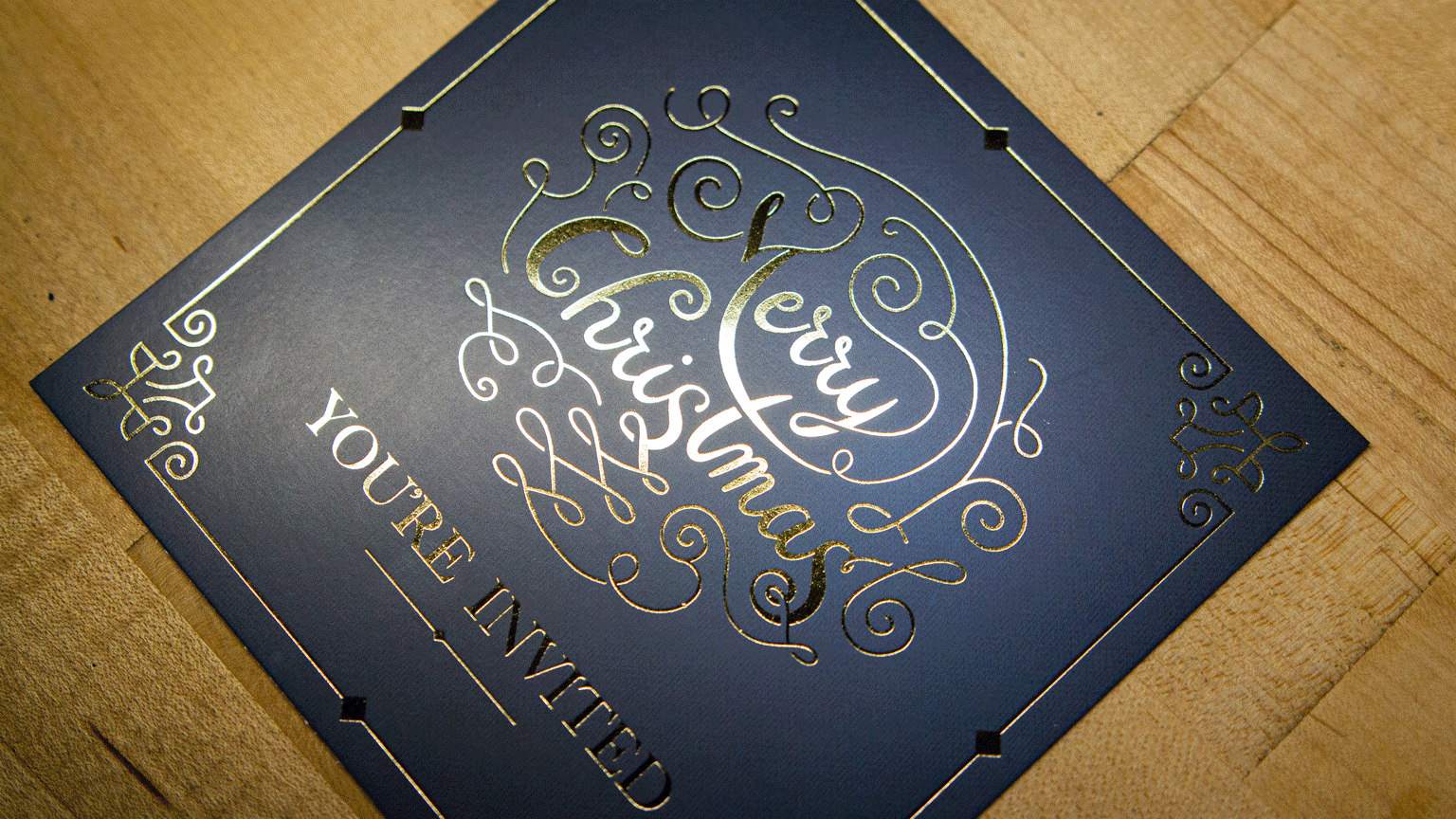
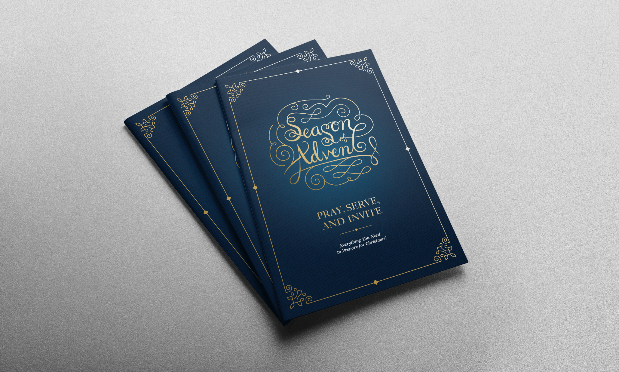
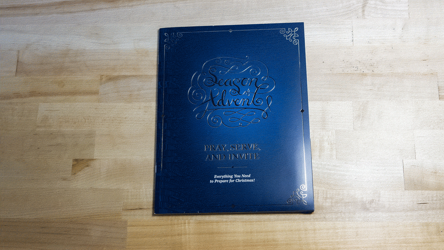
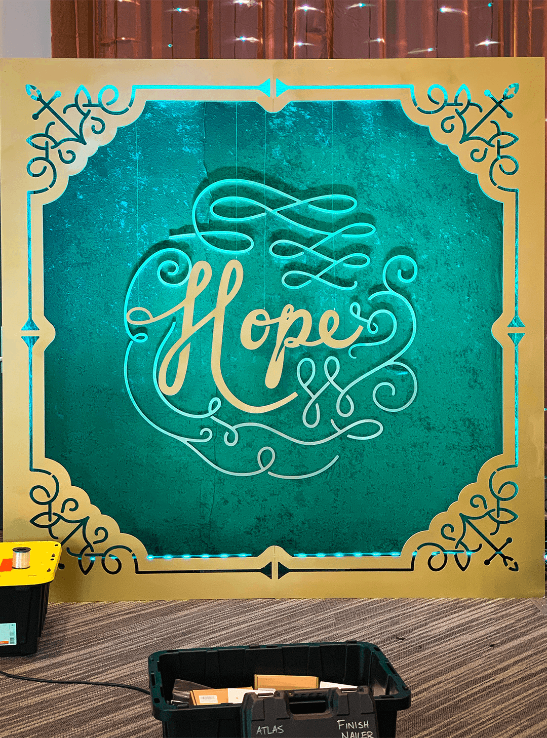
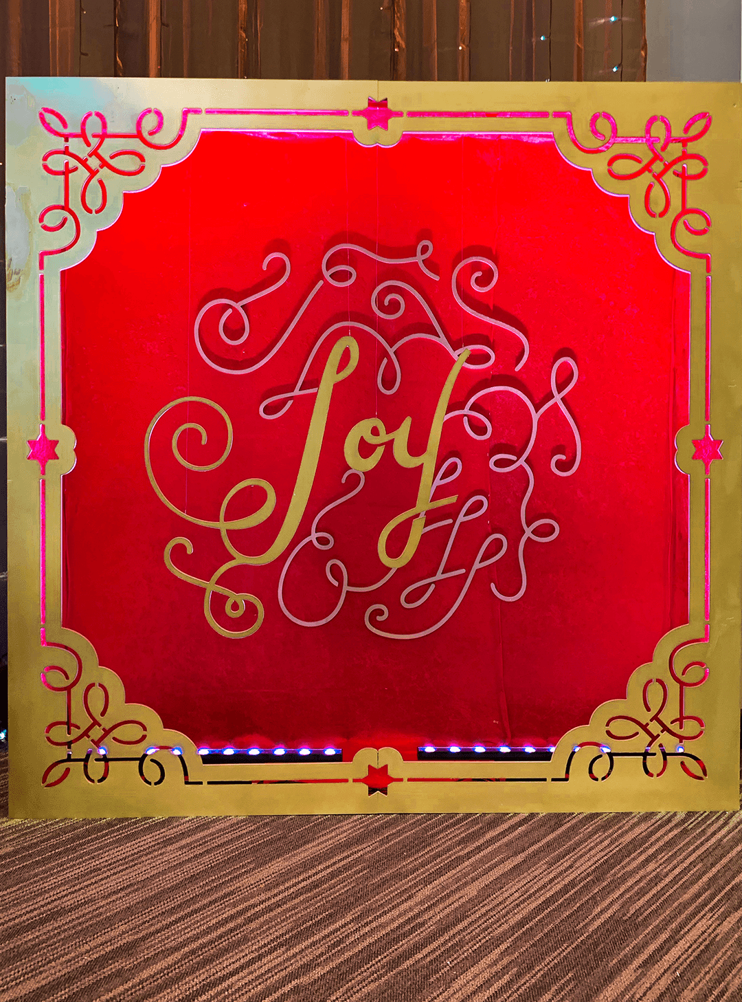
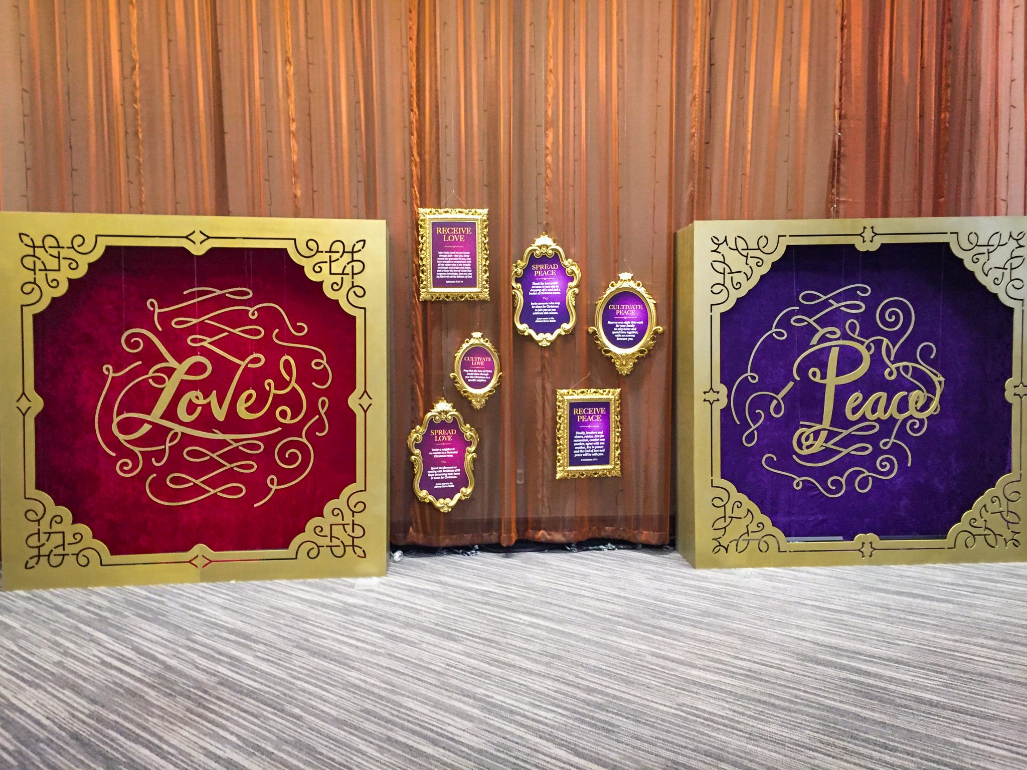
A design system that allows for Peace, Hope, Love, and Joy (the weeks of Advent) to speak their unique messages under one shared umbrella. Historic Christian symbols in monoline frames pay homage to tradition and modern design trends. Foliage feels elegant (and serious) while capturing joy with free-flowing lines. Custom lettering and foil capture a hand-crafted look while, to the unchurched, evoking an invite to a wedding—an event that, while serious and weighty, is reason for great joy, just like Christmas.


As usual, we made a style guide with main graphics, design elements, colors, typefaces, dropcaps, rationale—the whole shebang.
The Process
First, we did some research. We looked into Christian symbols, holiday design trends, illustrations, and other campaigns that elegantly communicated a complex message with one visual language.
That eventually led us to the world of lettering. It seemed like a great way to feel both handcrafted and modern, elegant and playful—all while handling complexity well. So, after getting approval in this direction, we started sketching lettering layouts.
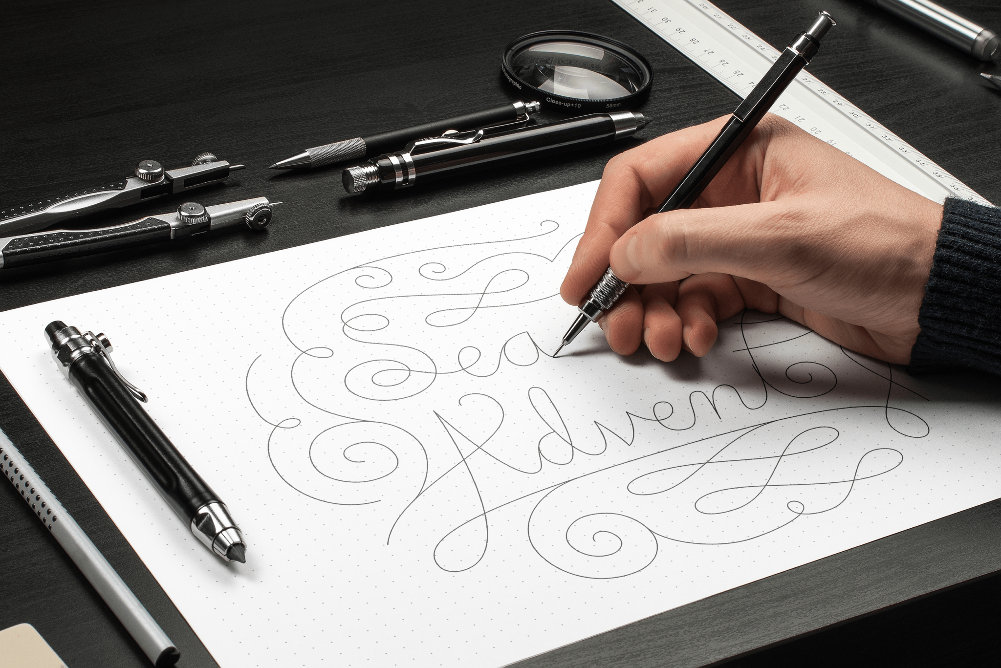
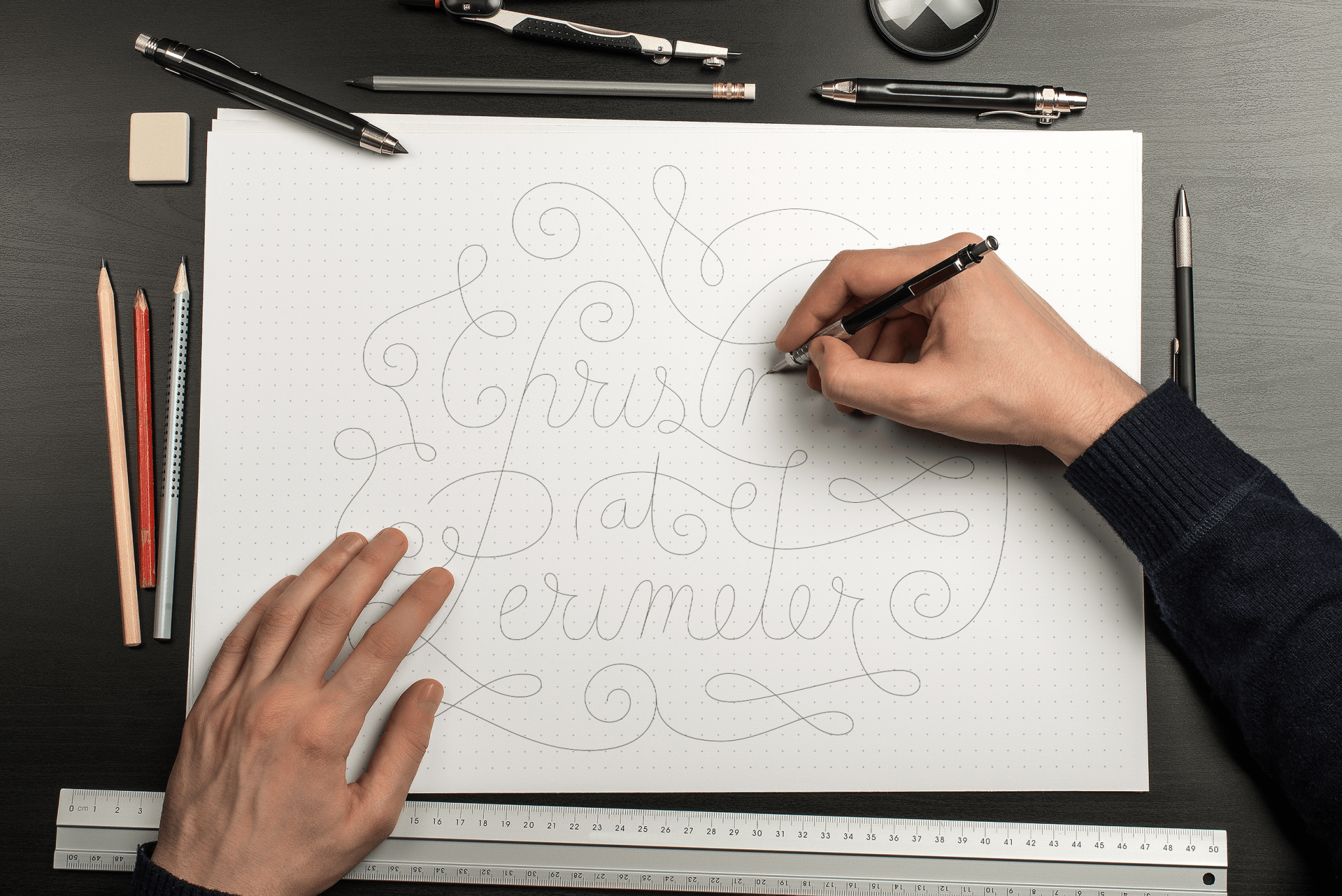
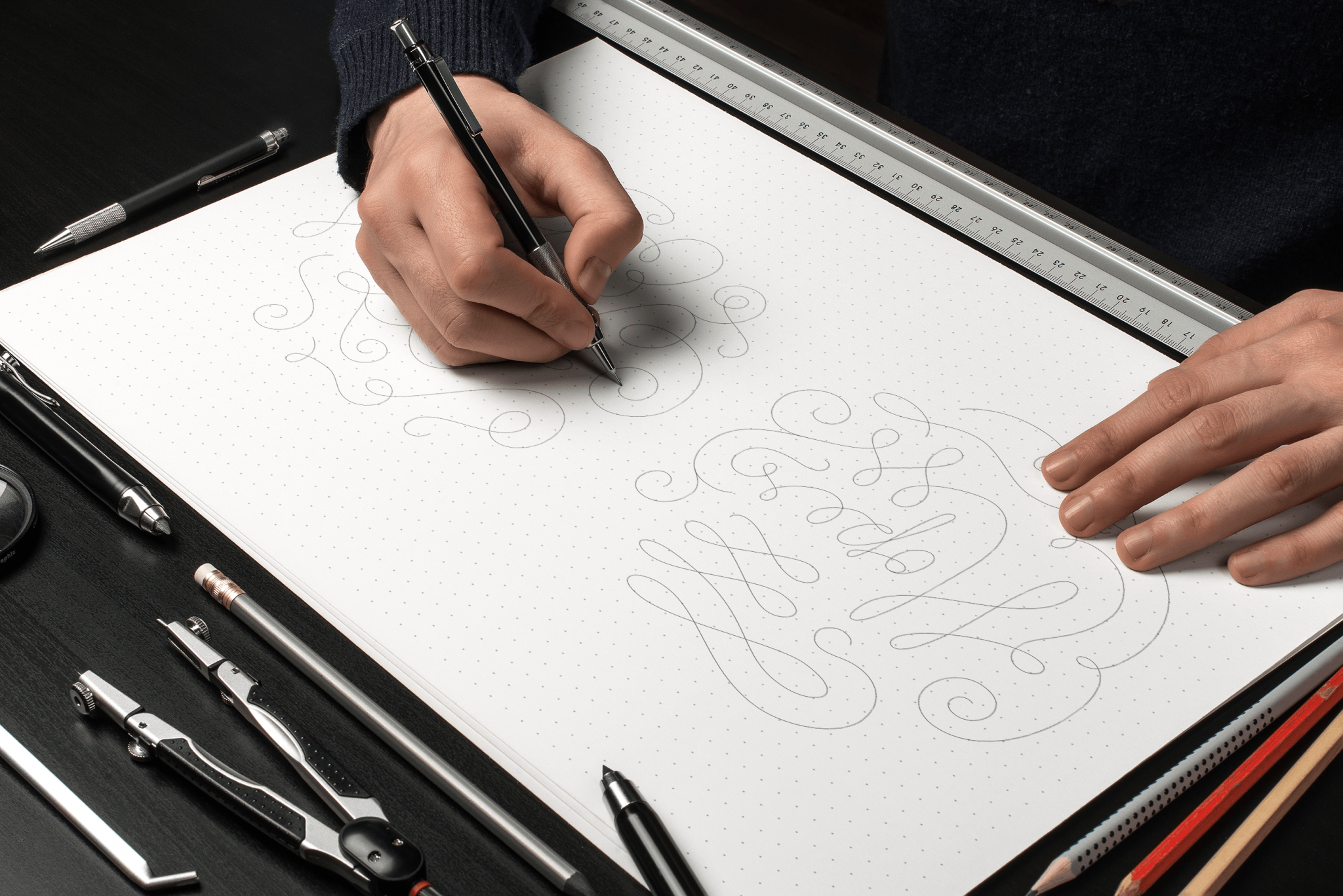
After sketching, we vectorized our drawings in Illustrator.
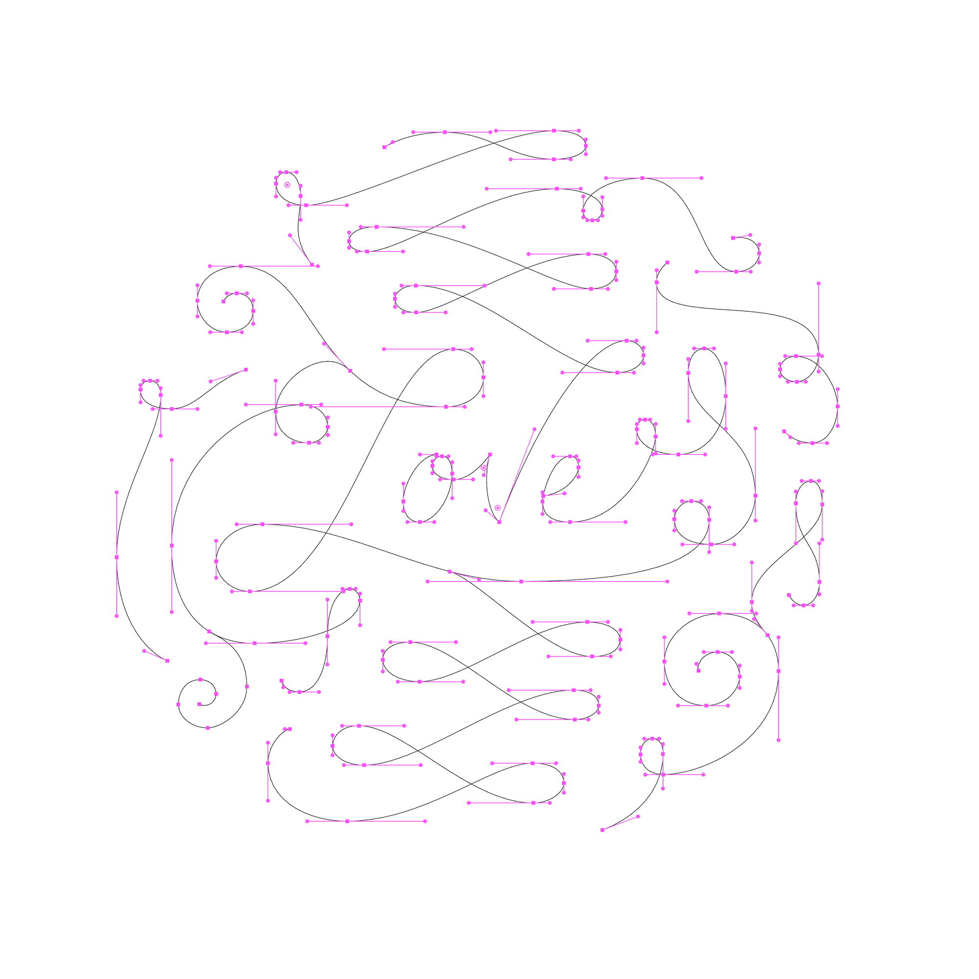
After playing with widths, spacing, and other small tweaks, we ended up with 100% scalable, high-quality lettering artwork that worked beautifully across all mediums:
Print & Digital Applications
Using the look laid out in the Style Guide, we designed 62+ print and digital pieces for this project, including:
- Invitations (with gold foil)
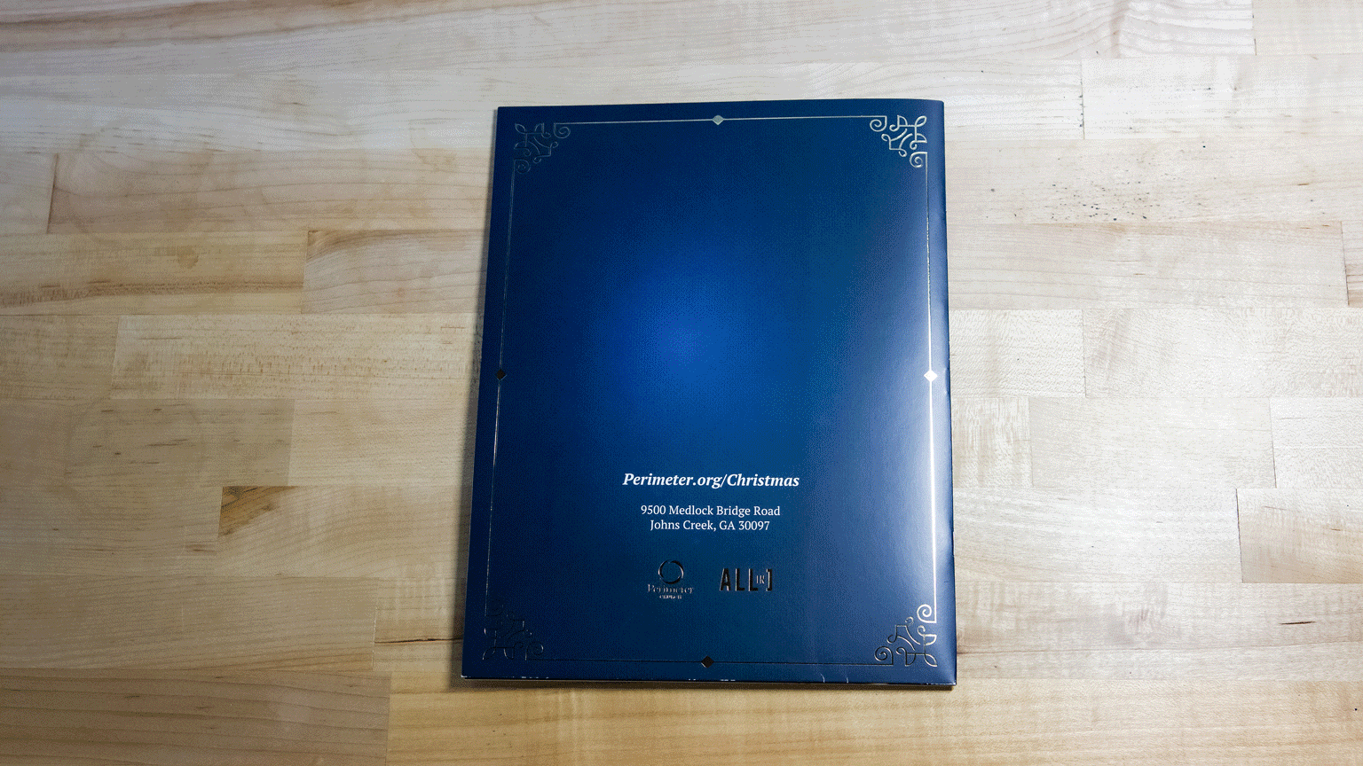
- Devotional booklets
- T-shirts
- Promotional graphics
- Mailers
- Environmental signage
- Bulletin shells & inserts
- Flyers
- Email newsletter templates
- Posters
Four-Episode Video Series
Braintrust produced, filmed, and edited four videos to be played during Perimeter's weekly service. Each video corresponds to one week of Advent: Hope, Peace, Love, or Joy.
Additional Lettering
We also hand-lettered five additional names for Perimeter to use in a video as part of the same campaign. We didn't produce the video below; our only contribution was the lettering.
Installations
Using the same design, we built four installations for each week of Advent: Peace, Hope, Love, and Joy. These were placed in Perimeter's main lobby area along with hanging framed content to accompany each week's main message. These elements, combined with floor-to-ceiling pixel-mapped light strips and curtains, created an environment that encouraged photos, communicated Advent's message, and attracted more people to Perimeter's gatherings.

Credits
Client: Perimeter Church
Agency: Braintrust Creative
Art Director: Drew Kimball
Graphic Designer: Edward Sun
Video Director & Editor: Drew Kimball
Video Producer: Lauren Scharfenberg
Installation Artist: Drew Kimball
Project & Account Manager: Lauren Scharfenberg